Design chunking in Scrum
When I started with agile (Scrum) software development five years ago one of the main challenges I faced was combining an agile development approach with user-experience driven website design.
Especially, as we were working on a global, consumer-oriented web site with a strong focus on product branding we needed to make sure that we could benefit from the agile development approach without losing focus on a consistent user experience (UX) and information architecture (IA) across the site.
Agile frameworks such as SCRUM and XP say absolutely nothing about the IA and user interaction design processes, which meant that we had to learn mainly by trial and error.
Most of the problems we faced originated from a clash of two fundamentally different world views:
UX people are driven by a holistic approach (big picture)
Dev teams focus on iterative and incremental development
To deliver a successful site none of the groups could be allowed to dominate and to find a balance we tried several approaches.
Our experiments:
Attempt 1: Concurrent IA, design and development
Attempt 2: Upfront IA and graphic design
Attempt 3: Post skinning
Attempt 1: Concurrent IA, design and development resulted in “piece meal” design and user interaction. We lost track of the big picture and lacked overall IA/design consistency across site. Also, our product owners found it difficult to keep an overview of the project.
Attempt 2: Upfront IA and graphic design caused problems with unused and out-of-date designs and feature specifications. Sometimes we finished an iteration or release with partially implemented features - very non-agile! We also found it difficult to adapt to feedback after the IA/design phase was completed.
Attempt 3: Post skinning (applying design after functionality has been developed) caused our implementation to drift from the design and user interaction intent and we often faced excessive and unnecessary re-coding and re-factoring work. The product owners and end users found it difficult to give feedback as non-shippable increments were demonstrated.
After three failed attempts we still wanted to utilize the advantages of an agile approach that would allow for continuous inspection and adaption and could help us to keep the focus on the most important parts of the site. Basically, we wanted to keep the agile advantages without sacrificing the overall user experience.
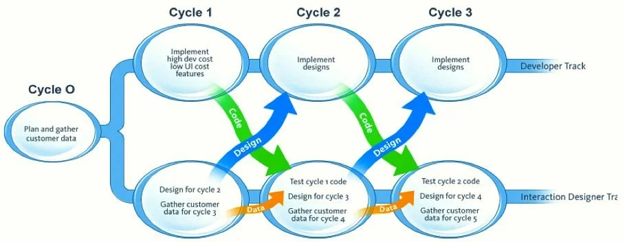
Attempt 4: Design-chunking - success!
(This term was originally coined by Lynn Miller)
With this approach we defined initial concepts upfront and subsequently broke the IA and user experience design apart into smaller pieces that could be delivered incrementally.
Design-chunking process:
The most important break-through came from two changes:
We introduced an iteration (sprint) 0
We de-coupled IA/user experience/graphic design from development
Iteration 0:
done before development begins
short (2-3 week) IA/user experience/graphic design only iteration to lay the groundwork
defines “big picture” on which subsequent designs and not yet fully defined areas of the site will be based
outcome 1: overall strategy for IA (site-wide elements such as page grid, navigation, rough placement of modules)
outcome 2: overall design concept including site-wide design guidelines
exact content balance between IA and design will be based on whether an IA or design led approach is used
signed off by client (partial IA and design sign-off) and discussed with developer to assess technical complexity
iteration 0 only covers fundamentals and potentially the details of the most important page. Details for other pages and areas of the site are still to be refined incrementally
Decoupling of IA/design and development:
after iteration 0 decoupling IA/design and software development into two independent tracks
tracks iterate separately but simultaneously and provide frequent feedback to each other
the IA/design track feeds a refined design of the most important features/page(s) to the development track at the end of each design iteration
the output from the IA/design track at the end of an iteration is used as input to the subsequent development iteration
for the IA/design track to feed the development track the IA/design track needs to be ahead in time - ideally this would be one iteration ahead with minor refinements still possible during the development iteration (e.g. change an image)
focus on potentially shippable increments of functionality to provide feedback opportunities for the client/users
This approach worked very well for us, we delivered nine releases to a happy client and in terms of process we felt we got the best of both worlds.
I would be very interested to hear your thoughts on this approach and particularly any experiences you may have had with similar issues in your projects - especially large and/or global web-based projects.
Also, an absolutely excellent description of this approach was done by Lynn Miller in her paper on Adapting Usability Investigations for Agile User-Centered Design. Much of my article is based on and inspired by her work. I only wish I had know about it before we started our extensive period of trial and error.
UPDATE: October 2016
This post is from 2008 and obviously pre-dates Lean UX . While this reflects what we knew at the time, I believe that the design chunking approach can still be used as an excellent stepping stone for getting to Lean UX.

